Project Prompt: Create a brand in a specific market and craft a logo, multiple logo forms and branding that encapsulates the purpose, audience and style of the brand. Apply branding and logo to mockups to demonstrate the branding in use and further establish the brands image.
My Brand: I chose to create a brand in the food industry. Because the food industry is so vast I knew I had to craft a brand that would stand out, and I did so by revolving my brand around one of my own favorite foods: peanut butter. My brand offers customers an experience through our custom peanut butter jars as well as tasty food options. PBcity is a peanut lovers dream come true!
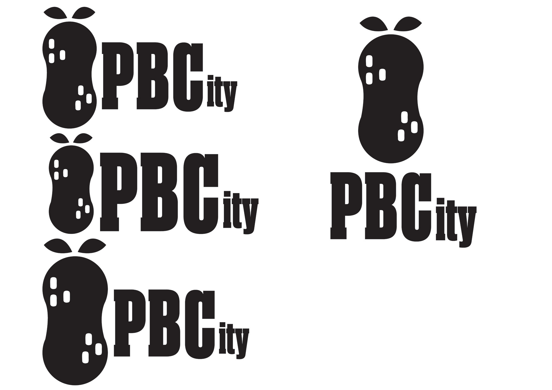
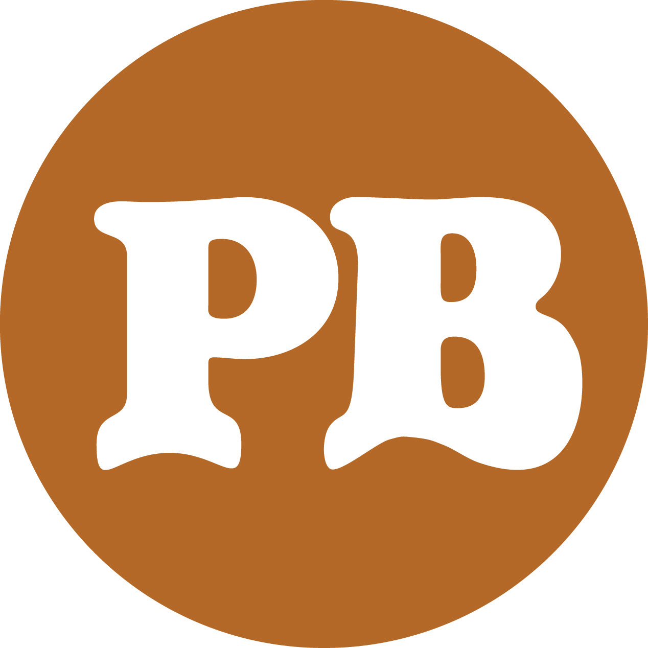
Final Logo Design
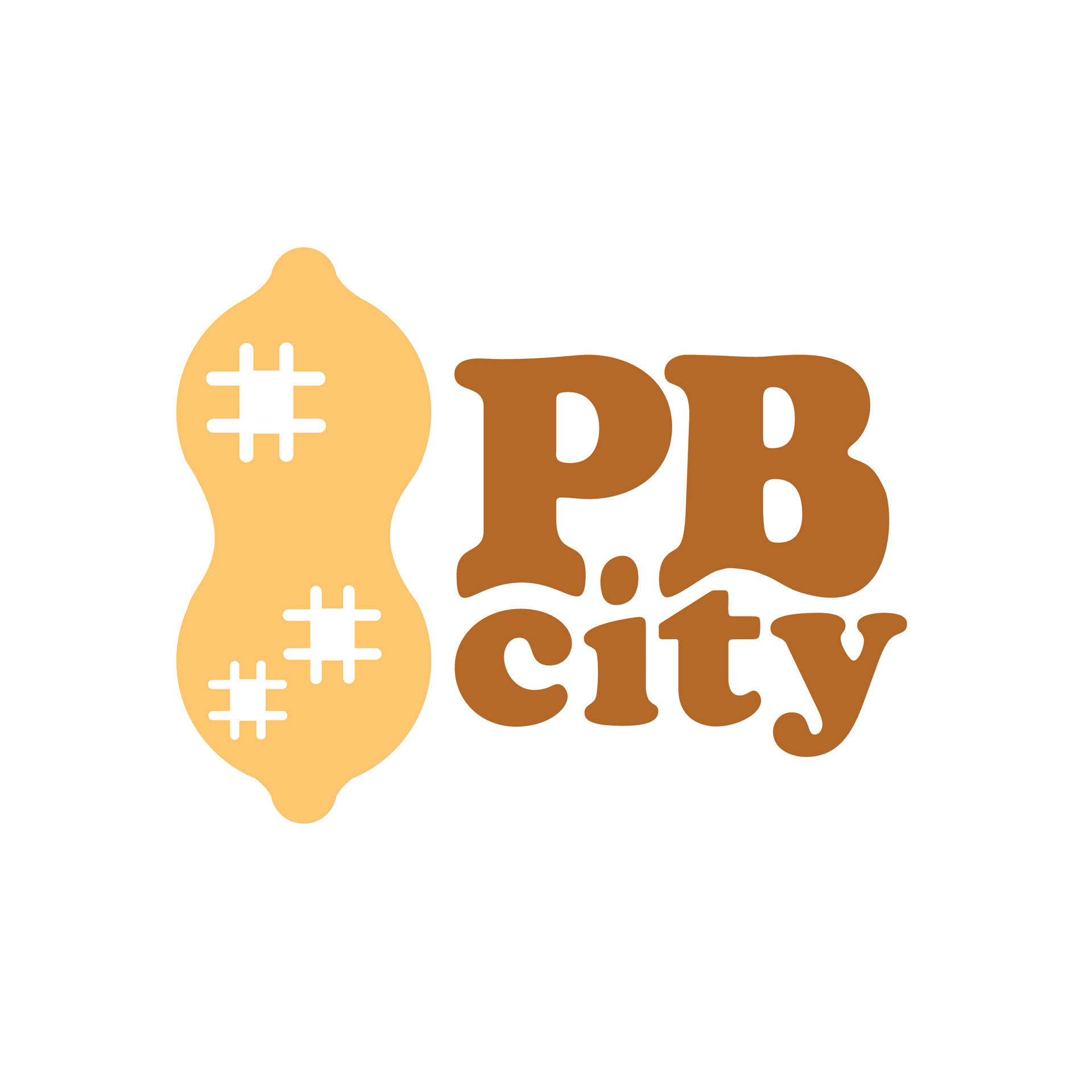
Final logo

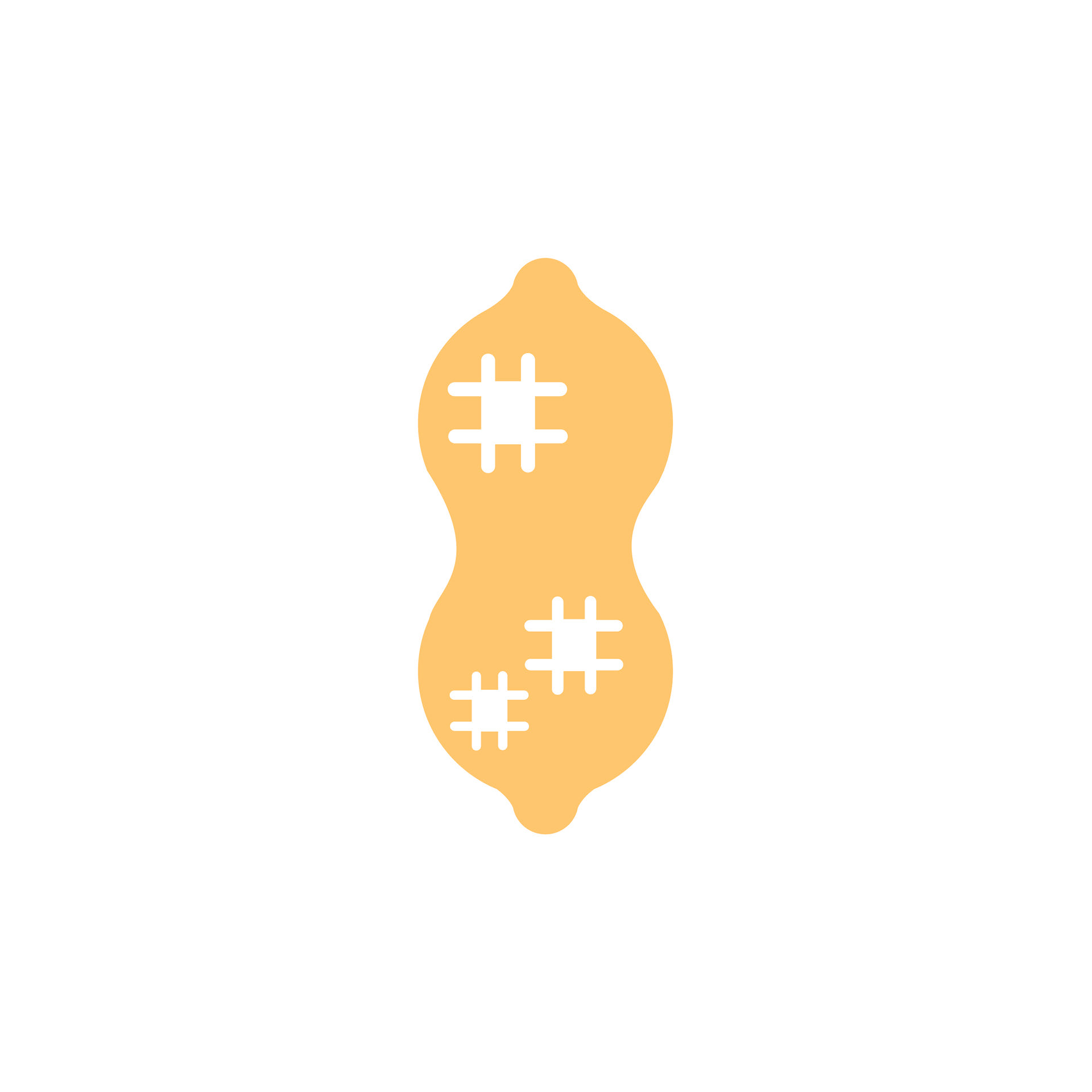
Final Digital Icon
Mockups

To go Bag mockup
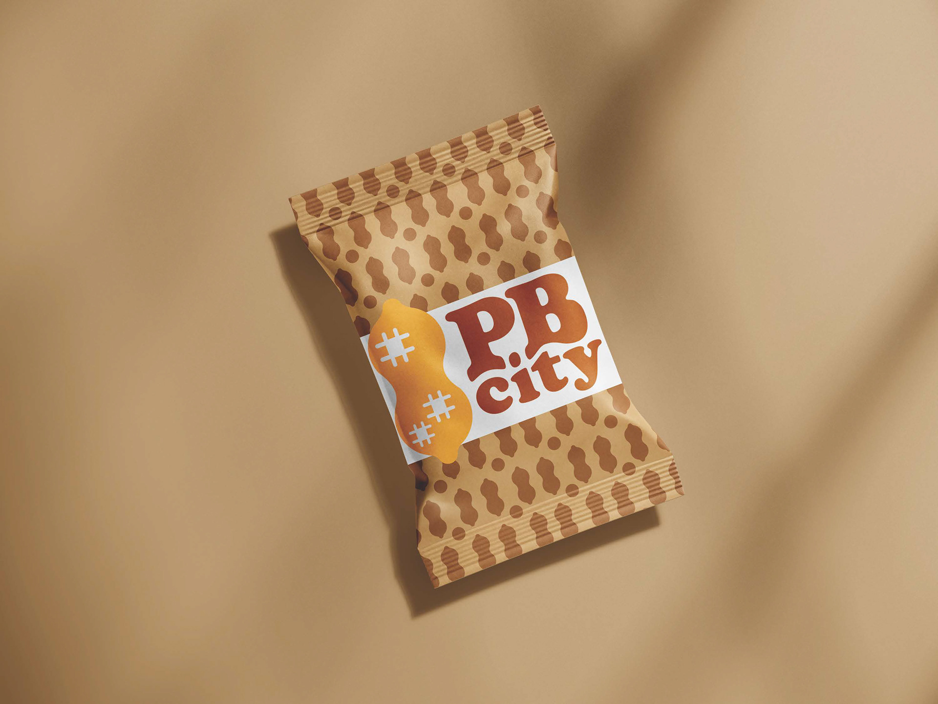
snack packaging mockup
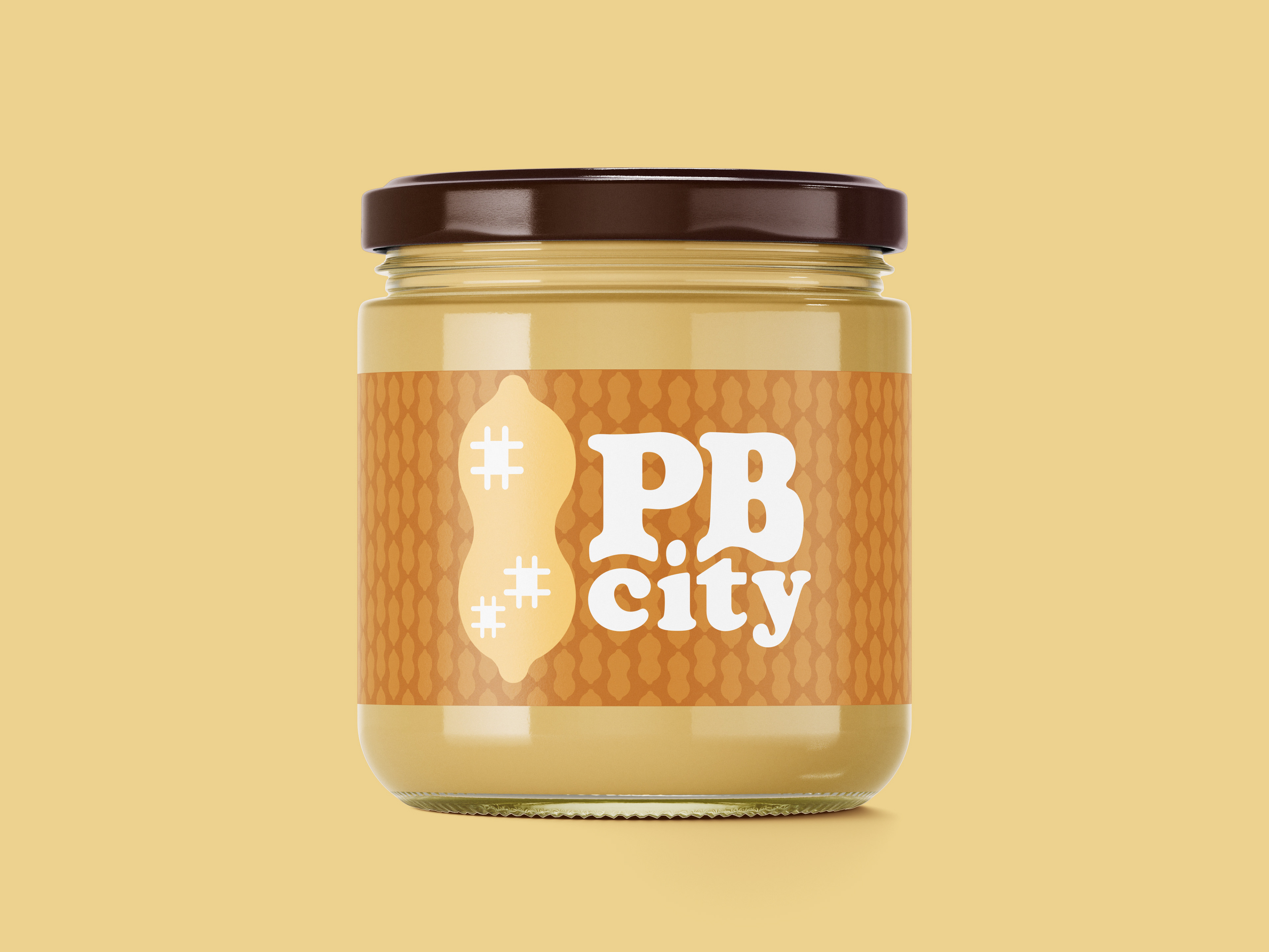
Custom Peanut Butter Jar Mockup
Research
I began by looking into similar companies. I found that most companies with similar concepts to mine specialized in dessert flavors of peanut butter and existed almost exclusively through online storefronts. This allows for my brand to stand out as it offers an experience and a personal customization touch that competitors cannot offer.

Similar companies websites
Process

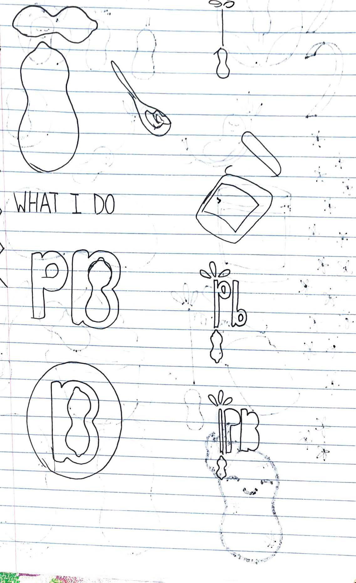
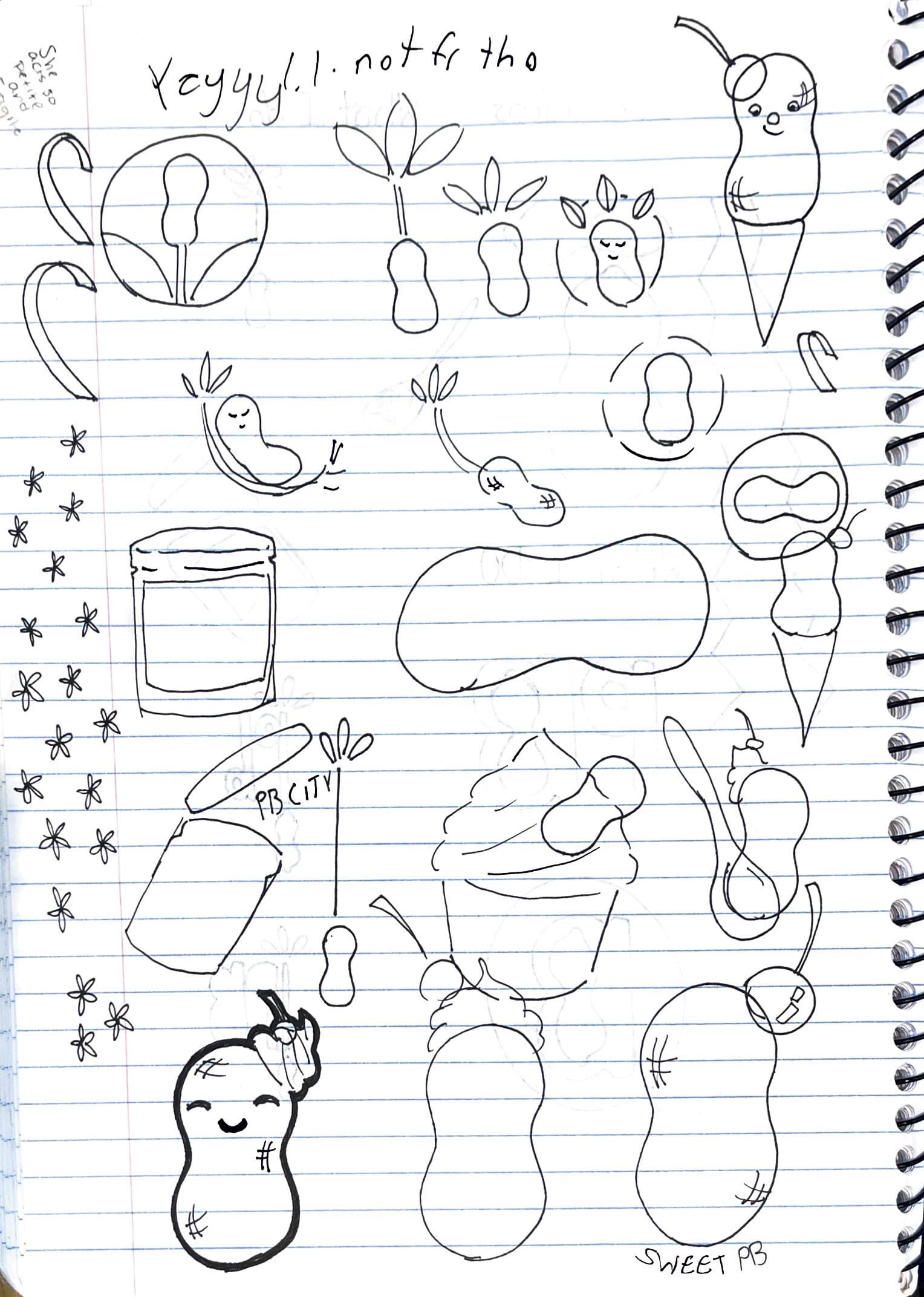
Above are my original sketches which I used as a starting point. From these sketched I chose my favorites and began designing them on illustrator.
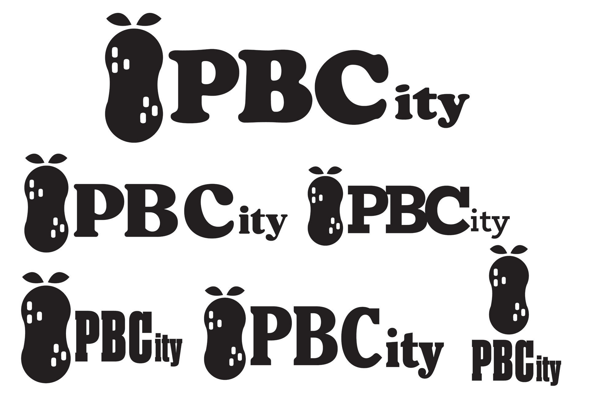
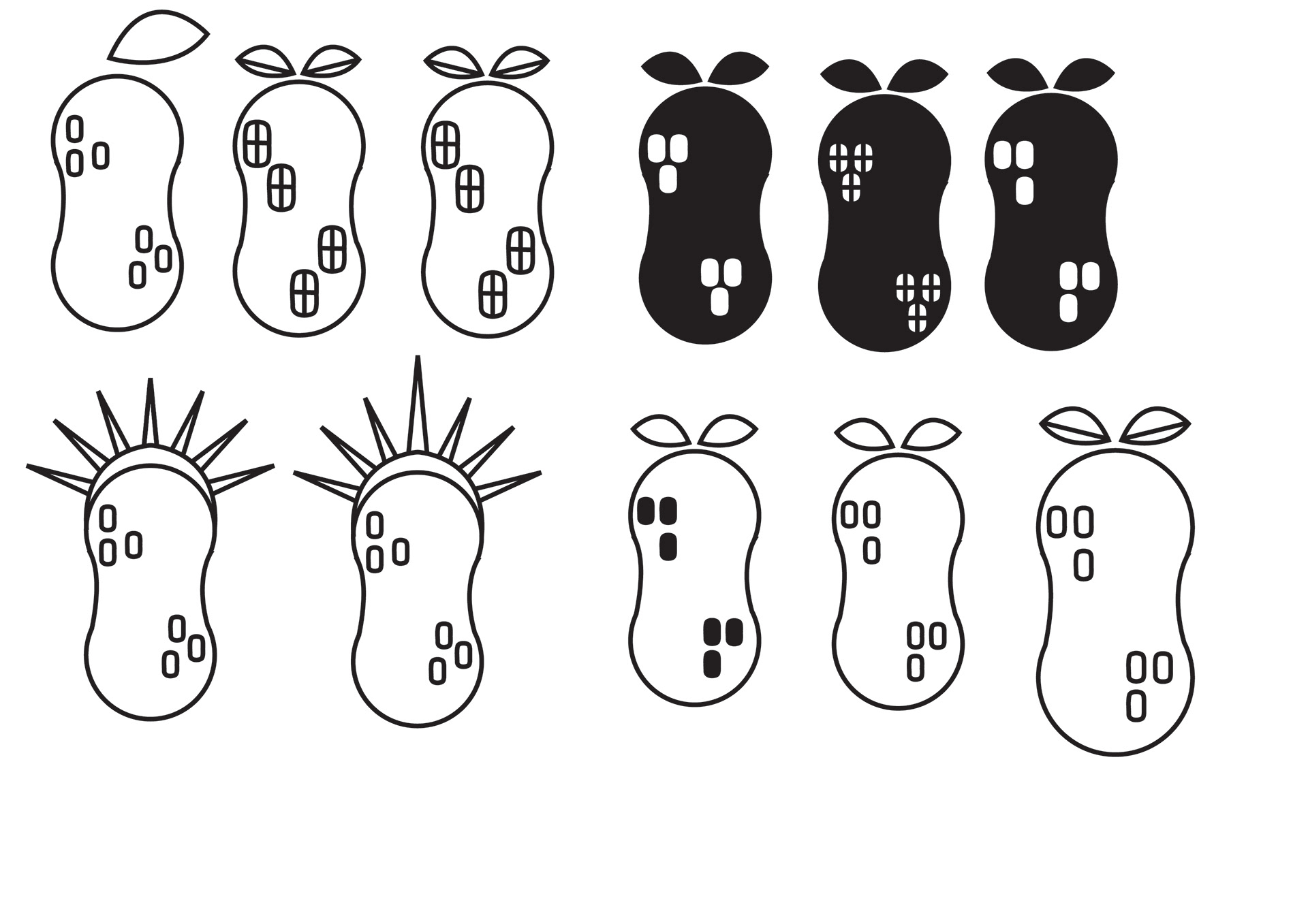
Above are some refined digital options. The simpler logos were more popular among my peers and were more reminiscent of health food marketing. I explored many typefaces that embodied the smoothness of peanut butter and peanuts as well as chunky typefaces similar to other peanut butter brands.
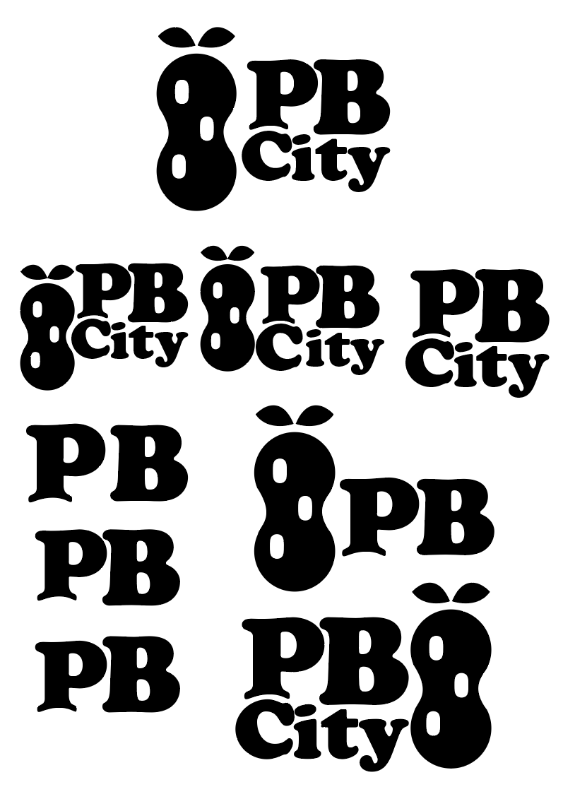
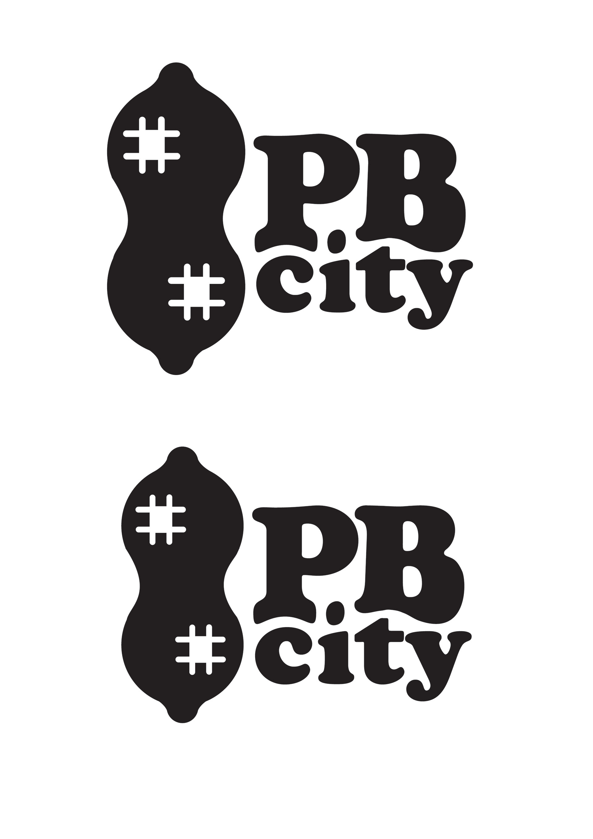


Above are some of my final variations for my logo. I added more shape to the peanut and applied three checkers to the peanut rather than the previous two. The odd number made the checkers more visually appealing. I began exploring color and decided to pair two earthy colors together both of which are similar to the color of a peanut. I decided on cooper as my typeface because of how organic and smooth it is. I altered the "B" in PB to nestle city underneath it and resemble a scoop of peanut butter. I rotated the tittle of the I to better fit between the P and B.
Final Designs

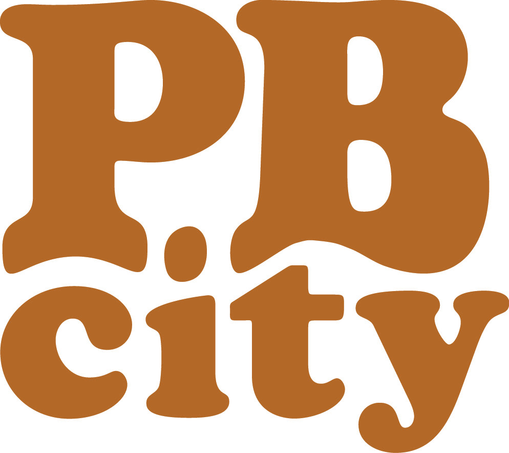
Above are my final logo designs. From left to right there is my final logo including type and icon, my final icon, my digital icon, and the typography alone.